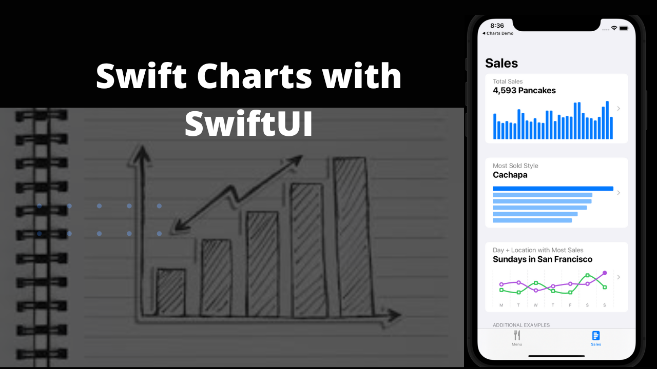
Swift Charts is a powerful and concise SwiftUI framework for transforming your effective data representation is a chart that helps you create charts entirely in SwiftUI that look and feel right at home on all Apple platforms. In this article, we’re going to explore Swift Chart.
How to make charts in SwiftUI?
There are many ways you can use Swift Charts to communicate patterns or trends in your data. You can create a variety of charts including line charts, bar charts, and PointMark as shown below.
This article was written using Xcode 14 and iOS 16 Beta
Create a Chart view that serves as a container for the data series that you want to draw:
Inside the chart, specify the graphical marks that represent the data. You can populate it with a variety of kinds of marks, like BarMark, PointMark or LineMark, that visually encode your data.
For many charts, the default configuration works well. However, in this case, the colors that the framework assigns to each mark don’t match the shape colors that they represent. You can customize the chart to override the default color scale by adding the chartForegroundStyleScale(_:) chart modifier:
Define the data source
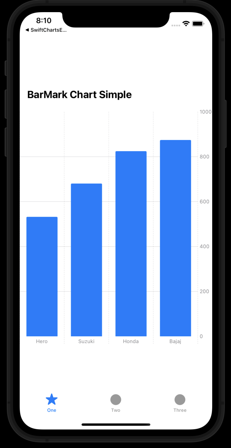
To display this information with a chart, create a BikeSell structure that represents the information that you want to visualize:struct BikeSell: Identifiable { var color: String var type: String var count: Double var id = UUID() } var data: [BikeSell] = [ .init(color: "Green", type: "Hero", count: 200), .init(color: "Green", type: "Suzuki", count: 80), .init(color: "Green", type: "Honda", count: 100), .init(color: "Yellow", type: "Bajaj", count: 69), .init(color: "Purple", type: "Hero", count: 34), .init(color: "Purple", type: "Suzuki", count: 65), .init(color: "Green", type: "Honda", count: 180), .init(color: "Yellow", type: "Bajaj", count: 203), .init(color: "Pink", type: "Hero", count: 108), .init(color: "Pink", type: "Suzuki", count: 205), .init(color: "Pink", type: "Honda", count: 300), .init(color: "Yellow", type: "Bajaj", count: 402), .init(color: "Yellow", type: "Hero", count: 190), .init(color: "Yellow", type: "Suzuki", count: 331), .init(color: "Yellow", type: "Honda", count: 245), .init(color: "Yellow", type: "Bajaj", count: 200) ]
Bar chart view:
How do I make a bar chart in SwiftUI?
Create a Chart view that serves as a container for the data series that you want to draw:
Inside the chart, specify the graphical marks that represent the data. You can populate it with a variety of kinds of marks, like BarMark, PointMark or LineMark, that visually encode your data.
struct BarMarkView: View {
    var body: some View {
        VStack(alignment: .leading) {
            Text("BarMark Chart Simple")
                .font(.title2.bold())
                .padding()
        Chart {
            ForEach(data) { shape in
                BarMark(
                    x: .value("Shape Type", shape.type),
                    y: .value("Total Count", shape.count)
                )
            }
        }
            .frame(height: 500)
        }
    }
}
Customize your chart
For many charts, the default configuration works well. However, in this case, the colors that the framework assigns to each mark don’t match the shape colors that they represent. You can customize the chart to override the default color scale by adding the chartForegroundStyleScale(_:) chart modifier:
import SwiftUI
import Charts

struct CustomizeBarMarkView: View {
    var body: some View {
        VStack(alignment: .leading) {
            Text("BarMark Chart Customize")
                .font(.title2.bold())
                .padding()
            Chart {
                ForEach(data) { shape in
                    BarMark(
                        x: .value("Shape Type", shape.type),
                        y: .value("Total Count", shape.count)
                    )
                    .foregroundStyle(by: .value("Shape Color", shape.color))
                }
            }
            .frame(height: 500)
            .chartForegroundStyleScale([
                "Green": .green, "Purple": .purple, "Pink": .pink, "Yellow": .yellow
            ])
        }
    }
}
Build & Run the project.
We create a line chart by encoding a category or date property, typically to the x position, and encoding a number category, typically to the y position. The example below encodes the weekday property to the x position and the sales property to the y position.
import SwiftUI
import Charts


func date(year: Int, month: Int, day: Int = 1) -> Date {
    Calendar.current.date(from: DateComponents(year: year, month: month, day: day)) ?? Date()
}
struct Series: Identifiable {
    let city: String
    let sales: [(weekday: Date, sales: Int)]
    var id = UUID()
}

 let last30Days: [Series] = [
    .init(city: "Haryana", sales: [
        (weekday: date(year: 2022, month: 5, day: 2), sales: 54),
        (weekday: date(year: 2022, month: 5, day: 3), sales: 42),
        (weekday: date(year: 2022, month: 5, day: 4), sales: 88),
        (weekday: date(year: 2022, month: 5, day: 5), sales: 49),
        (weekday: date(year: 2022, month: 5, day: 6), sales: 42),
        (weekday: date(year: 2022, month: 5, day: 7), sales: 25),
        (weekday: date(year: 2022, month: 5, day: 8), sales: 67)

    ]),
    .init(city: "Delhi", sales: [
        (weekday: date(year: 2022, month: 5, day: 2), sales: 81),
        (weekday: date(year: 2022, month: 5, day: 3), sales: 90),
        (weekday: date(year: 2022, month: 5, day: 4), sales: 80),
        (weekday: date(year: 2022, month: 5, day: 5), sales: 72),
        (weekday: date(year: 2022, month: 5, day: 6), sales: 84),
        (weekday: date(year: 2022, month: 5, day: 7), sales: 84),
        (weekday: date(year: 2022, month: 5, day: 8), sales: 37)
    ])
]
struct LineMarkView: View {
    var body: some View {
        VStack(alignment: .leading) {
            Text("LineMark Chart Demo")
                .font(.title2.bold())
                .padding()


            Chart(last30Days ) { series in
                ForEach(series.sales, id: \.weekday) { element in
                    LineMark(
                        x: .value("Day", element.weekday, unit: .day),
                        y: .value("Sales", element.sales)
                    )
                }
                .foregroundStyle(by: .value("City", series.city))
                .symbol(by: .value("City", series.city))
                .interpolationMethod(.catmullRom)
            }
            .chartForegroundStyleScale([
                "Haryana": .purple,
                "Delhi": .green
            ])
            .chartXAxis {
                AxisMarks(values: .stride(by: .day)) { _ in
                    AxisTick()
                    AxisGridLine()
                    AxisValueLabel(format: .dateTime.weekday(.abbreviated), centered: true)
                }
            }
            .chartLegend(position: .bottom)
        }

    }

}

struct LineMarkView_Previews: PreviewProvider {
    static var previews: some View {
        LineMarkView()
    }
}
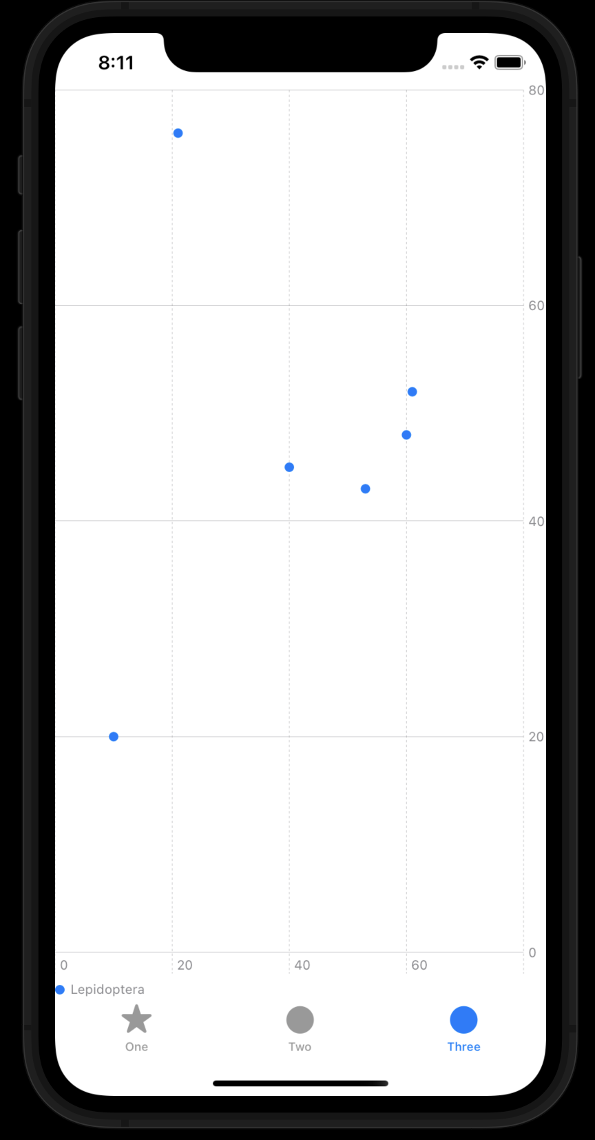
PointMark Chart
You can create different kinds of point charts using the PointMark chart content. One common chart you can build with point marks is a scatter plot which displays the relationship between two numerical data properties. To build a scatter plot use the init(x:y:). Provide a .value for both the x and y parameters with a string, used as a label for the data, and the data element to encode, via a key path or closure. The following example encodes the wingLength and wingHeight properties to x and y, respectively:// // PointMarkView.swift // Charts Demo // // Created by Sushil on 11/06/22. // import SwiftUI import Charts struct Insect: Identifiable { var id = UUID() let name: String let family: String let wingLength: Double let wingWidth: Double let weight: Double } var pointData: [Insect] = [ Insect(name: "Hepialidae", family: "Lepidoptera", wingLength: 61, wingWidth: 52, weight: 22), Insect(name: "Danaidae", family: "Lepidoptera", wingLength: 60, wingWidth: 48, weight: 24), Insect(name: "Riodinidae", family: "Lepidoptera", wingLength: 53, wingWidth: 43, weight: 18), Insect(name: "Hepialidae", family: "Lepidoptera", wingLength: 40, wingWidth: 45, weight: 40), Insect(name: "Danaidae", family: "Lepidoptera", wingLength: 21, wingWidth: 76, weight: 44), Insect(name: "Riodinidae", family: "Lepidoptera", wingLength: 10, wingWidth: 20, weight: 30) // ... ] struct PointMarkView: View { var body: some View { Chart(pointData) { PointMark( x: .value("Wing Length", $0.wingLength), y: .value("Wing Width", $0.wingWidth) ) .symbol(by: .value("Family", $0.family)) .foregroundStyle(by: .value("Family", $0.family)) } } } struct PointMarkView_Previews: PreviewProvider { static var previews: some View { PointMarkView() } }
Build & Run the project.
Thanks for reading and happy coding. 🙂
Related Posts:
- Create rounded bars in ios Charts
- How to big numbers YAxis format values convert to Indian Numbering Format like k(thousand), L(lakh), Cr(crore), Ar(Arab) and etc.on iOS barchart Swift
- How to make Rounded Corner BarChart with iOS-charts?
- Top Best App Store Alternatives for IOS 2022
- What’s new in iOS 16 — For Developers in swiftUI | What was the newest announcement for SwiftUI iOS 16?
- How to set up push notifications in Swift 5 iOS
- How can I write text in multi-lines in Swift?
- What was the newest announcement for SwiftUI iOS 16?


0 Comments